
(Yeah, that’s Ellen. We go way back.)
Monday, October 24, the IHG Owners Association (an organization representing IHG Hotel Franchisees worldwide, formerly known as IAHI, The Owners’ Association) premiered its new brand platform during the IHG Americas Conference in Las Vegas—culminating a re-branding process we began with them just over a year ago.
And yes, the headline was an exaggeration—but, given the comments (at the bottom of this post) of the association’s VP of Sales and Marketing, Jill Ellis, we’d like to think the work was well-received.
BACKGROUND
For several years, the IAHI had used the logo below—incorporating a literal globe image. Our feeling was that, given the leverage they’d built-up in that identity, we shouldn’t throw-out the proverbial baby with the bathwater.
![]() Instead, given the organization’s mission, we recommended developing an iconic globe image incorporating human-form outlines in place of land masses.
Instead, given the organization’s mission, we recommended developing an iconic globe image incorporating human-form outlines in place of land masses.
Our client contact throughout the process (Director of Communications Chris Lambert—whom many of our clients remember as Hare Communications’ fine account executive Chris Byrum, once upon a time) liked the idea. And she added a key idea of her own: For one of the people / land-masses, use the profile of Holiday Inn founder Kemmons Wilson.
TEST GROUP REACTIONS TO THE LOGO
You literally couldn’t write a better script. On at least two separate occasions, when Chris revealed the new logo to test groups, their initial comments went in exactly this order:
“Well, I can tell it’s a globe, but I don’t recognize the continents.”
”Wait a minute, those are people.”
”And hey, the person on the left…That’s Kemmons Wilson, isn’t it?”
Click Here to see new logo
WEBSITE RE-DESIGN
Once we had approval on both the logo and our recommended color palette for the new brand, we applied that foundation to their website.
Click Here to see screen shots of the old site.
The new site is still a work in progress (primarily where copy and secondary-page layouts are concerned), but we’re very pleased with the way the home page looks. (BTW: The color bars beside the primary image come directly from the new brand’s palette.)
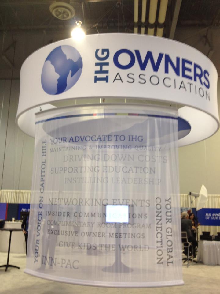
BOOTH DISPLAY
We also produced the graphics for their booth. And while we can’t take credit for the (very impressive) booth layout—which came to us from Chicago—we certainly love the final results. Below is a snapshot, taken at the show, of the booth’s centerpiece. (Click the thumbnail to enlarge).
Our primary conceptual contribution to the booth involved the challenge of depicting an evolution of the IAHI’s brand over time. Our solution: A “time-lapse” collage of photos (and IAHI logos), most taken from a book that documents the association’s first 55 years. Click Here to see the results.
JILL’S POST-CONFERENCE EMAIL
“Although you weren’t with us in Vegas, I can assure you that you were there in spirit. What a significant moment it was for this organization and the future. Your team, combined with Chris’ leadership on the rebranding project, made for a dynamic chemistry that delivered a compelling visual sign of change to our audience.
“We heard nothing but compliments on the new logo and supporting elements. We couldn’t be more pleased with the quality of work that has evolved from this project. The website has also received high marks!”
Is it any wonder we love this client?